CSS
CSS TUTORIAL IN BANGLA PART-9:CSS display flex
display:flex
একটি <div> এর মধ্যে অবস্থিত child <div> গুলোকে একটা row আকারে সাজানোর জন্য CSS display flex ব্যবহৃত হয়। CSS display flex অনেক ভাবেই ব্যাবহার করা যায়। এটা div কে মাঝে দেখাতেও ব্যবহার করা হয়। সবচেয়ে বড় ব্যাপার হলো, অনেক সময় কন্টেন্ট বড় ছোট বা ইমেজ বড় ছোট হওয়ার কারনে div অনেক সময় নিচে চলে আসে (masonry এর মত) হয়ে যায়। এটা থেকে পরিত্রান পেতে সহজ উপায় হল CSS display flex ব্যবহার করা।
। চলুন নিচের উদাহরণ দেখা যাক:
01 02 03 04 05 06 07 08 09 10 11 12 13 14 15 16 17 18 19 20 21 22 23 24 25 26 27 28 | <!DOCTYPE html><html><head><style>.flex-container { display: flex; background-color: DodgerBlue;}.flex-container > div { background-color: #FFB2B2; margin: 10px; padding: 20px; font-size: 30px;}</style></head><body><div class="flex-container"> <div>1</div> <div>2</div> <div>3</div> <div>4</div> <div>5</div> <div>6</div> </div></body></html> |
Output
CSS display flex এর মধ্যে flex-direction Property
আবার আপনি চাইলে flex-direction property এর মাধ্যমে এর direction ও set করতে পারেন। flex-direction property এর চারটি value:
- flex-direction:row
- flex-direction:row-reverse
- flex-direction:column
- flex-direction:colum-reverse
Example flex-direction:column
01 02 03 04 05 06 07 08 09 10 11 12 13 14 15 16 17 18 19 20 21 22 23 24 25 26 27 28 | <!DOCTYPE html><html><head><style>.flex-container { display: flex; flex-direction: column; background-color: DodgerBlue;}.flex-container > div { background-color: darkorange; width: 100px; margin: 10px; text-align: center; line-height: 75px; font-size: 30px;}</style></head><body><div class="flex-container"> <div>1</div> <div>2</div> <div>3</div> </div></body></html> |
Output
flex-direction:row Example
01 02 03 04 05 06 07 08 09 10 11 12 13 14 15 16 17 18 19 20 21 22 23 24 25 26 27 28 | <!DOCTYPE html><html><head><style>.flex-container { display: flex; flex-direction: row; background-color: DodgerBlue;}.flex-container > div { background-color: darkorange; width: 100px; margin: 10px; text-align: center; line-height: 75px; font-size: 30px;}</style></head><body><div class="flex-container"> <div>1</div> <div>2</div> <div>3</div> </div></body></html> |
Output
flex-direction:row-reverse Example
01 02 03 04 05 06 07 08 09 10 11 12 13 14 15 16 17 18 19 20 21 22 23 24 25 26 27 28 | <!DOCTYPE html><html><head><style>.flex-container { display: flex; flex-direction: row-reverse; background-color: DodgerBlue;}.flex-container > div { background-color: darkorange; width: 100px; margin: 10px; text-align: center; line-height: 75px; font-size: 30px;}</style></head><body><div class="flex-container"> <div>1</div> <div>2</div> <div>3</div> </div></body></html> |
Output
CSS display flex এর মধ্যে flex-direction:column-reverse Example
01 02 03 04 05 06 07 08 09 10 11 12 13 14 15 16 17 18 19 20 21 22 23 24 25 26 27 28 | <!DOCTYPE html><html><head><style>.flex-container { display: flex; flex-direction: column-reverse; background-color: DodgerBlue;}.flex-container > div { background-color: darkorange; width: 100px; margin: 10px; text-align: center; line-height: 75px; font-size: 30px;}</style></head><body><div class="flex-container"> <div>1</div> <div>2</div> <div>3</div> </div></body></html> |
Output
CSS display flex এর মধ্যে display: inline-flex;
flex item গুলোকে তার container সহ inline করার জন্য display:inline-flex ব্যবহৃত হয়। চলুন দুটি উদাহরণের মাধ্যমে display:flex এবং display:inline-flex এর পার্থক্য বুঝে নেয়া যাক:
Example 1: display: flex
01 02 03 04 05 06 07 08 09 10 11 12 13 14 15 16 17 18 19 20 21 22 23 24 25 26 27 28 29 30 31 32 33 34 35 36 37 38 | <!DOCTYPE html><html><head> <title>Display flex example</title> <style type="text/css"> .container--flex { background-color: #64B5F6; margin-bottom: 10px; display: flex; } .flex-child { flex: 1; min-width: 50px; min-height: 50px; margin: 10px; background-color: #F06292; } </style></head><body><div class="container--flex"> <div style="flex-child"></div> <div class="flex-child"></div> <div class="flex-child"></div></div><div class="container--flex"> <div class="flex-child"></div> <div class="flex-child"></div> <div class="flex-child"></div></div><div class="container--flex"> <div class="flex-child"></div> <div class="flex-child"></div> <div class="flex-child"></div></div></body></html> |
Output
ব্যাখ্যা: display:flex ব্যবহার করায় প্রত্যেকটি container–flex তার child element গুলোকে নিয়ে আলাদা row তে অবস্থান করতেছে। এমনকি যেকোনো অবস্থাতেই প্রত্যেকটি row আলাদা থেকে ছোট অথবা বড় হবে।
Example 2: display: inline-flex
01 02 03 04 05 06 07 08 09 10 11 12 13 14 15 16 17 18 19 20 21 22 23 24 25 26 27 28 29 30 31 32 33 34 35 36 37 38 | <!DOCTYPE html><html><head> <title>Display inline-flex example</title> <style type="text/css"> .container--inline-flex { background-color: #64B5F6; margin-bottom: 10px; display: inline-flex; } .flex-child { flex: 1; min-width: 50px; min-height: 50px; margin: 10px; background-color: #F06292; } </style></head><body><div class="container--inline-flex"> <div class="flex-child"></div> <div class="flex-child"></div> <div class="flex-child"></div></div><div class="container--inline-flex"> <div class="flex-child"></div> <div class="flex-child"></div> <div class="flex-child"></div></div><div class="container--inline-flex"> <div class="flex-child"></div> <div class="flex-child"></div> <div class="flex-child"></div></div></body></html> |
Output
ব্যাখ্যা: লক্ষ্য করুন, এখানে flex item গুলো তার container সহ inline এ প্রদর্শন করতেছে।
CSS flex-wrap Property
flex-wrap property এর মাধ্যমে আপনি flex Item গুলো wrap হবে কি হবেনা বা কোন অর্ডারে হবে তা নির্ধারণ করে । আর flex-wrap property এর তিনটি value আছে , আর তা হলো :
- wrap
- nowrap
- wrap-reverse
flex-wrap: wrap; Example
01 02 03 04 05 06 07 08 09 10 11 12 13 14 15 16 17 18 19 20 21 22 23 24 25 26 27 28 29 30 31 32 33 34 35 36 37 | <!DOCTYPE html><html><head><style>.flex-container { display: flex; flex-wrap: wrap; background-color: purple;}.flex-container>div { background-color: darkorange; width: 100px; margin: 10px; text-align: center; line-height: 75px; font-size: 30px;}</style></head><body><div class="flex-container"> <div>1</div> <div>2</div> <div>3</div> <div>4</div> <div>5</div> <div>6</div> <div>7</div> <div>8</div> <div>9</div> <div>10</div> <div>11</div> <div>12</div> </div></body></html> |
Output
flex-wrap: nowrap; Example
01 02 03 04 05 06 07 08 09 10 11 12 13 14 15 16 17 18 19 20 21 22 23 24 25 26 27 28 29 30 31 32 33 34 35 36 37 | <!DOCTYPE html><html><head><style>.flex-container { display: flex; flex-wrap: nowrap; background-color: purple;}.flex-container>div { background-color: darkorange; width: 100px; margin: 10px; text-align: center; line-height: 75px; font-size: 30px;}</style></head><body><div class="flex-container"> <div>1</div> <div>2</div> <div>3</div> <div>4</div> <div>5</div> <div>6</div> <div>7</div> <div>8</div> <div>9</div> <div>10</div> <div>11</div> <div>12</div> </div></body></html> |
Output
flex-wrap: wrap-reverse; Example
01 02 03 04 05 06 07 08 09 10 11 12 13 14 15 16 17 18 19 20 21 22 23 24 25 26 27 28 29 30 31 32 33 34 35 36 37 | <!DOCTYPE html><html><head><style>.flex-container { display: flex; flex-wrap: wrap-reverse;; background-color: purple;}.flex-container>div { background-color: darkorange; width: 100px; margin: 10px; text-align: center; line-height: 75px; font-size: 30px;}</style></head><body><div class="flex-container"> <div>1</div> <div>2</div> <div>3</div> <div>4</div> <div>5</div> <div>6</div> <div>7</div> <div>8</div> <div>9</div> <div>10</div> <div>11</div> <div>12</div> </div></body></html> |
Output
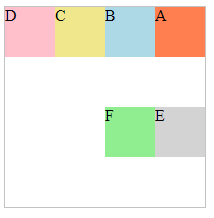
CSS flex-basis
flex এর মধ্যে অবস্থিত আইটেম গুলোকে একটা ইনিশিয়াল length দেয়ার জন্য flex-basis property ব্যবহৃত হয়। চলুন একটা উদাহরণ দিয়ে দেখা যাক:
01 02 03 04 05 06 07 08 09 10 11 12 13 14 15 16 17 18 19 20 21 22 23 24 25 26 27 28 29 30 31 32 33 | <!DOCTYPE html><html><head><style>#main { width: 300px; height: 100px; border: 1px solid #c3c3c3; display: -webkit-flex; /* Safari */ display: flex;}#main div { -webkit-flex-basis: 50px; /* Safari 6.1+ */ flex-basis: 50px;}#main div:nth-of-type(2) { -webkit-flex-basis: 100px; /* Safari 6.1+ */ flex-basis: 100px;}</style></head><body><div id="main"> <div style="background-color:coral;">50px</div> <div style="background-color:lightblue;">100px</div> <div style="background-color:khaki;">50px</div> <div style="background-color:pink;">50px</div> <div style="background-color:lightgrey;">50px</div></div></body></html> |
Output
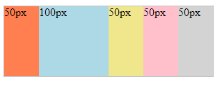
ব্যাখ্যা: এখানে আমরা flex item গুলোর ইনিশিয়াল length 50 pixel নির্ধারণ করেছি , এবং শুধু দ্বিতীয় আইটেমকে 100 pixel পর্যন্ত বর্ধিত করেছি , এতে ওই দ্বিতীয় আইটেমটি ছাড়া বাকি সব এর length 50 pixel এর মধ্যেই রয়েছে।
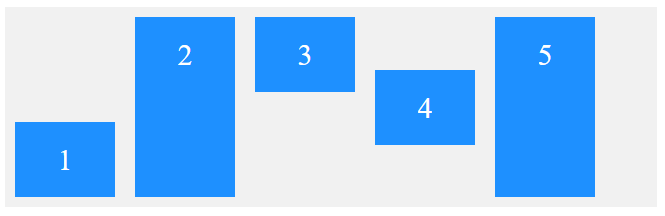
CSS flex-grow property
একই কন্টেইনার এর মধ্যে অবস্থিত flex item গুলোর কোনো নির্দিষ্ট আইটেমকে বাকি আইটেম গুলোর কয় গুন বর্ধিত হবে তা নির্ধারণের জন্য CSS flex-grow property ব্যবহৃত হয়। চলুন একটা উদাহরণ দিয়ে দেখা যাক:
01 02 03 04 05 06 07 08 09 10 11 12 13 14 15 16 17 18 19 20 21 22 23 24 25 26 27 28 29 30 31 32 33 34 35 36 37 | <!DOCTYPE html><html><head><style>#main { width: 350px; height: 100px; border: 1px solid #c3c3c3; display: -webkit-flex; /* Safari */ display: flex;}/* Safari 6.1+ */#main div:nth-of-type(1) {-webkit-flex-grow: 1;}#main div:nth-of-type(2) {-webkit-flex-grow: 3;}#main div:nth-of-type(3) {-webkit-flex-grow: 1;}#main div:nth-of-type(4) {-webkit-flex-grow: 2;}#main div:nth-of-type(5) {-webkit-flex-grow: 1;}/* Standard syntax */#main div:nth-of-type(1) {flex-grow: 1;}#main div:nth-of-type(2) {flex-grow: 3;}#main div:nth-of-type(3) {flex-grow: 1;}#main div:nth-of-type(4) {flex-grow: 2;}#main div:nth-of-type(5) {flex-grow: 1;}</style></head><body><div id="main"> <div style="background-color:coral;"></div> <div style="background-color:lightblue;"></div> <div style="background-color:khaki;"></div> <div style="background-color:pink;"></div> <div style="background-color:lightgrey;"></div></div></body></html> |
Output
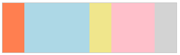
ব্যাখ্যা: এখানে আমরা flex item গুলোর সব গুলোর মোট length 350 pixel নির্ধারণ করেছি , এবং সেই অনুযায়ী সবগুলো সম length এ বসে যাবে , তবে দ্বিতীয় আইটেমকে 3 গুন্ বর্ধিত করেছি এবং চতুর্থ আইটেমকে ২ গুন্ বর্ধিত করেছি।
CSS flex-shrink property
CSS এ flex-shrink ঠিক flex-grow এর বিপরীত , অর্থাৎ এটি একই কন্টেইনার এর মধ্যে অবস্থিত flex item গুলোর কোনো নির্দিষ্ট আইটেমকে বাকি আইটেম গুলোর কয় গুন সংকোচিত হবে তা নির্ধারণের জন্য CSS flex-shrink property ব্যবহৃত হয়। চলুন একটা উদাহরণ দিয়ে দেখা যাক:
01 02 03 04 05 06 07 08 09 10 11 12 13 14 15 16 17 18 19 20 21 22 23 24 25 26 27 28 29 30 31 32 33 34 35 36 37 | <!DOCTYPE html><html><head><style> #main { width: 350px; height: 100px; border: 1px solid #c3c3c3; display: -webkit-flex; /* Safari */ display: flex;}#main div { -webkit-flex-grow: 1; /* Safari 6.1+ */ -webkit-flex-shrink: 1; /* Safari 6.1+ */ -webkit-flex-basis: 100px; /* Safari 6.1+ */ flex-grow: 1; flex-shrink: 1; flex-basis: 100px;}#main div:nth-of-type(2) { -webkit-flex-shrink: 3; /* Safari 6.1+ */ flex-shrink: 3;}</style></head><body><div id="main"> <div style="background-color:coral;"></div> <div style="background-color:lightblue;"></div> <div style="background-color:khaki;"></div> <div style="background-color:pink;"></div> <div style="background-color:lightgrey;"></div></div></body></html> |
Output
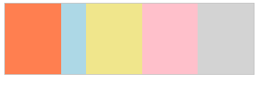
ব্যাখ্যা: এখানে আমরা flex item গুলোর সব গুলোর মোট length 350 pixel নির্ধারণ করেছি , এবং সেই অনুযায়ী সবগুলো সম length এ বসে যাবে , তবে দ্বিতীয় আইটেমকে 3 গুন্ সংকোচিত করেছি , সে জন্য সেটি ৩ গুন্ সংকোচিত হয়েছে।
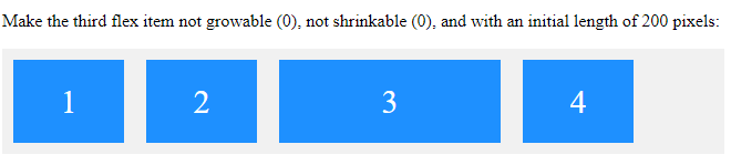
CSS display flex: flex Property
CSS এ flex property হচ্ছে flex-grow, flex-shrink এবং flex-basis property গুলোর shorthand property . চলুন একটা উদাহরণে দেখা যাক:
01 02 03 04 05 06 07 08 09 10 11 12 13 14 15 16 17 18 19 20 21 22 23 24 25 26 27 28 29 30 31 32 33 34 | <!DOCTYPE html><html><head><style>.flex-container { display: flex; align-items: stretch; background-color: #f1f1f1;}.flex-container>div { background-color: DodgerBlue; color: white; width: 100px; margin: 10px; text-align: center; line-height: 75px; font-size: 30px;}</style></head><body><p>Make the third flex item not growable (0), not shrinkable (0), and with an initial length of 200 pixels:</p><div class="flex-container"> <div>1</div> <div>2</div> <div style="flex: 0 0 200px">3</div> <div>4</div></div></body></html> |
Output
CSS display flex: flex-flow Property
CSS এ flex-flow property হচ্ছে CSS flex-direction এবং flex-wrap property দুটির shorthand property . চলুন একটা উদাহরণে দেখা যাক:
01 02 03 04 05 06 07 08 09 10 11 12 13 14 15 16 17 18 19 20 21 22 23 24 25 26 27 28 29 30 31 | <!DOCTYPE html><html><head><style> #main { width: 200px; height: 200px; border: 1px solid #c3c3c3; display: -webkit-flex; /* Safari */ -webkit-flex-flow: row-reverse wrap; /* Safari 6.1+ */ display: flex; flex-flow: row-reverse wrap;}#main div { width: 50px; height: 50px;}</style></head><body><div id="main"> <div style="background-color:coral;">A</div> <div style="background-color:lightblue;">B</div> <div style="background-color:khaki;">C</div> <div style="background-color:pink;">D</div> <div style="background-color:lightgrey;">E</div> <div style="background-color:lightgreen;">F</div></div></body></html> |
Output
CSS display flex: justify-content Property
CSS এ flex item গুলোকে horizontally alignment দেওয়ার জন্য justify-content Propertyব্যবহৃত হয়। justify-content প্রোপার্টিতে নিম্নের ভ্যালু গুলো ব্যবহৃত হয় :
- justify-content: center; এটি flex item গুলোকে Center alignment দেওয়ার জন্য justify-content:center ব্যবহৃত হয়।
- justify-content: flex-start; এটি flex item গুলোকে container এর শুরু থেকে align দেওয়ার জন্য ব্যবহৃত হয়।
- justify-content: flex-end; এটি flex item গুলোকে container এর শেষের থেকে align দেওয়ার জন্য ব্যবহৃত হয়।
- justify-content: space-around; এটি flex item গুলোকে লাইনের আগে, মাঝখানে এবং পরে অবস্থান করানোর জন্য ব্যবহৃত হয়।
- justify-content: space-between; এটি flex item গুলোকে লাইনের মাঝখান ফাঁকা জায়গায় অবস্থান করানোর জন্য ব্যবহৃত হয়।
justify-content: center; Example
01 02 03 04 05 06 07 08 09 10 11 12 13 14 15 16 17 18 19 20 21 22 23 24 25 26 27 28 | <!DOCTYPE html><html><head><style>.flex-container { display: flex; justify-content: center; background-color: DodgerBlue;}.flex-container > div { background-color: #f1f1f1; width: 100px; margin: 10px; text-align: center; line-height: 75px; font-size: 30px;}</style></head><body><div class="flex-container"> <div>1</div> <div>2</div> <div>3</div> </div></body></html> |
Output
justify-content: flex-start; Example
01 02 03 04 05 06 07 08 09 10 11 12 13 14 15 16 17 18 19 20 21 22 23 24 25 26 27 28 | <!DOCTYPE html><html><head><style>.flex-container { display: flex; justify-content: flex-start; background-color: DodgerBlue;}.flex-container > div { background-color: #f1f1f1; width: 100px; margin: 10px; text-align: center; line-height: 75px; font-size: 30px;}</style></head><body><div class="flex-container"> <div>1</div> <div>2</div> <div>3</div> </div></body></html> |
Output
justify-content: flex-end; Example
01 02 03 04 05 06 07 08 09 10 11 12 13 14 15 16 17 18 19 20 21 22 23 24 25 26 27 28 | <!DOCTYPE html><html><head><style>.flex-container { display: flex; justify-content: flex-end; background-color: DodgerBlue;}.flex-container > div { background-color: #f1f1f1; width: 100px; margin: 10px; text-align: center; line-height: 75px; font-size: 30px;}</style></head><body><div class="flex-container"> <div>1</div> <div>2</div> <div>3</div> </div></body></html> |
Output
justify-content: space-around;
01 02 03 04 05 06 07 08 09 10 11 12 13 14 15 16 17 18 19 20 21 22 23 24 25 26 27 28 29 30 | <!DOCTYPE html><html><head><style>.flex-container { display: flex; justify-content: space-around; background-color: DodgerBlue;}.flex-container > div { background-color: #f1f1f1; width: 100px; margin: 10px; text-align: center; line-height: 75px; font-size: 30px;}</style></head><body><div class="flex-container"> <div>1</div> <div>2</div> <div>3</div> </div></body></html> |
Output
justify-content: space-between; Example
01 02 03 04 05 06 07 08 09 10 11 12 13 14 15 16 17 18 19 20 21 22 23 24 25 26 27 28 | <!DOCTYPE html><html><head><style>.flex-container { display: flex; justify-content: space-between; background-color: DodgerBlue;}.flex-container > div { background-color: #f1f1f1; width: 100px; margin: 10px; text-align: center; line-height: 75px; font-size: 30px;}</style></head><body><div class="flex-container"> <div>1</div> <div>2</div> <div>3</div> </div></body></html> |
Output
CSS display flex: align-items Property
CSS display flex এর flex item গুলোকে vertically alignment দেওয়ার জন্য align-items Property ব্যবহৃত হয়। align-items প্রোপার্টিতে নিম্নের ভ্যালু গুলো ব্যবহৃত হয় :
- align-items: center; এটি flex item গুলোকে vertically Center alignment দেওয়ার জন্য justify-content:center ব্যবহৃত হয়।
- align-items: flex-start; এটি flex item গুলোকে vertically container এর শুরু থেকে align দেওয়ার জন্য ব্যবহৃত হয়।
- align-items: flex-end; এটি flex item গুলোকে vertically container এর শেষের থেকে align দেওয়ার জন্য ব্যবহৃত হয়।
- align-items: baseline; এটি flex item গুলোকে vertically baseline বরাবর align দেওয়ার জন্য ব্যবহৃত হয়।
align-items: center; Example
01 02 03 04 05 06 07 08 09 10 11 12 13 14 15 16 17 18 19 20 21 22 23 24 25 26 27 28 | <!DOCTYPE html><html><head><style>.flex-container { display: flex; align-items: center; background-color: DodgerBlue;}.flex-container > div { background-color: #f1f1f1; width: 100px; margin: 10px; text-align: center; line-height: 75px; font-size: 30px;}</style></head><body><div class="flex-container"> <div>1</div> <div>2</div> <div>3</div> </div></body></html> |
Output
align-items: flex-start; Example
01 02 03 04 05 06 07 08 09 10 11 12 13 14 15 16 17 18 19 20 21 22 23 24 25 26 27 28 | <!DOCTYPE html><html><head><style>.flex-container { display: flex; align-items: flex-start; background-color: DodgerBlue;}.flex-container > div { background-color: #f1f1f1; width: 100px; margin: 10px; text-align: center; line-height: 75px; font-size: 30px;}</style></head><body><div class="flex-container"> <div>1</div> <div>2</div> <div>3</div> </div></body></html> |
Output
align-items: flex-end; Example
01 02 03 04 05 06 07 08 09 10 11 12 13 14 15 16 17 18 19 20 21 22 23 24 25 26 27 28 | <!DOCTYPE html><html><head><style>.flex-container { display: flex; align-items: flex-end; background-color: DodgerBlue;}.flex-container > div { background-color: #f1f1f1; width: 100px; margin: 10px; text-align: center; line-height: 75px; font-size: 30px;}</style></head><body><div class="flex-container"> <div>1</div> <div>2</div> <div>3</div> </div></body></html> |
Output
align-items: baseline; Example
01 02 03 04 05 06 07 08 09 10 11 12 13 14 15 16 17 18 19 20 21 22 23 24 25 26 27 28 29 30 31 32 | <!DOCTYPE html><html><head><style>.flex-container { display: flex; height: 200px; align-items: baseline; background-color: DodgerBlue;}.flex-container > div { background-color: #f1f1f1; width: 100px; margin: 10px; text-align: center; line-height: 75px; font-size: 30px;}</style></head><body><div class="flex-container"> <div><h2>1</h2></div> <div><h6>2</h6></div> <div><h3>3</h3></div> <div><small>4</small></div> </div></body></html> |
Output
1
2
3
CSS display flex: align-content Property
CSS display flex এ Flex লাইন গুলোর alignment দেওয়ার জন্য align-content Propertyব্যবহৃত হয়। align-content প্রোপার্টিতে নিম্নের ভ্যালু গুলো ব্যবহৃত হয় :
- align-content: center; এটি flex line কে Center alignment দেওয়ার জন্য justify-content:center ব্যবহৃত হয়।
- align-content: flex-start; এটি flex line কে container এর শুরু থেকে align দেওয়ার জন্য ব্যবহৃত হয়।
- align-content: flex-end; এটি flex line কে container এর শেষের থেকে align দেওয়ার জন্য ব্যবহৃত হয়।
- align-content: space-around; এটি flex line কে লাইনের আগে, মাঝখানে এবং পরে অবস্থান করানোর জন্য ব্যবহৃত হয়।
- align-content: space-between; এটি flex line কে লাইনের মাঝখান ফাঁকা জায়গায় অবস্থান করানোর জন্য ব্যবহৃত হয়।
align-content:center; example
01 02 03 04 05 06 07 08 09 10 11 12 13 14 15 16 17 18 19 20 21 22 23 24 25 26 27 28 29 30 31 32 33 34 35 36 37 38 39 40 | <!DOCTYPE html><html><head><style>.flex-container { display: flex; height: 400px; flex-wrap: wrap; align-content: center; background-color: DodgerBlue;}.flex-container > div { background-color: #f1f1f1; width: 100px; margin: 10px; text-align: center; line-height: 75px; font-size: 30px;}</style></head><body><div class="flex-container"> <div>1</div> <div>2</div> <div>3</div> <div>4</div> <div>5</div> <div>6</div> <div>7</div> <div>8</div> <div>9</div> <div>10</div> <div>11</div> <div>12</div> </div></body></html> |
Output
align-content: flex-start; example
01 02 03 04 05 06 07 08 09 10 11 12 13 14 15 16 17 18 19 20 21 22 23 24 25 26 27 28 29 30 31 32 33 34 35 36 37 38 39 40 41 42 | <!DOCTYPE html><html><head><style>.flex-container { display: flex; height: 600px; flex-wrap: wrap; align-content: flex-start; background-color: DodgerBlue;}.flex-container > div { background-color: #f1f1f1; width: 100px; margin: 10px; text-align: center; line-height: 75px; font-size: 30px;}</style></head><body><h2>CSS display flex: align-content Property</h2><div class="flex-container"> <div>1</div> <div>2</div> <div>3</div> <div>4</div> <div>5</div> <div>6</div> <div>7</div> <div>8</div> <div>9</div> <div>10</div> <div>11</div> <div>12</div> </div></body></html> |
Output
align-content: flex-end; example
01 02 03 04 05 06 07 08 09 10 11 12 13 14 15 16 17 18 19 20 21 22 23 24 25 26 27 28 29 30 31 32 33 34 35 36 37 38 39 40 41 | <!DOCTYPE html><html><head><style>.flex-container { display: flex; height: 600px; flex-wrap: wrap; align-content: flex-end; background-color: DodgerBlue;}.flex-container > div { background-color: #f1f1f1; width: 100px; margin: 10px; text-align: center; line-height: 75px; font-size: 30px;}</style></head><body><h2>CSS display flex: align-content Property</h2><div class="flex-container"> <div>1</div> <div>2</div> <div>3</div> <div>4</div> <div>5</div> <div>6</div> <div>7</div> <div>8</div> <div>9</div> <div>10</div> <div>11</div> <div>12</div> </div></body></html> |
Output
align-content: space-around; example
01 02 03 04 05 06 07 08 09 10 11 12 13 14 15 16 17 18 19 20 21 22 23 24 25 26 27 28 29 30 31 32 33 34 35 36 37 38 39 40 41 | <!DOCTYPE html><html><head><style>.flex-container { display: flex; height: 600px; flex-wrap: wrap; align-content: space-around; background-color: DodgerBlue;}.flex-container > div { background-color: #f1f1f1; width: 100px; margin: 10px; text-align: center; line-height: 75px; font-size: 30px;}</style></head><body><h2>CSS display flex: align-content Property</h2><div class="flex-container"> <div>1</div> <div>2</div> <div>3</div> <div>4</div> <div>5</div> <div>6</div> <div>7</div> <div>8</div> <div>9</div> <div>10</div> <div>11</div> <div>12</div> </div></body></html> |
Output
align-content: space-between; example
01 02 03 04 05 06 07 08 09 10 11 12 13 14 15 16 17 18 19 20 21 22 23 24 25 26 27 28 29 30 31 32 33 34 35 36 37 38 39 40 41 | <!DOCTYPE html><html><head><style>.flex-container { display: flex; height: 600px; flex-wrap: wrap; align-content: space-between; background-color: DodgerBlue;}.flex-container > div { background-color: #f1f1f1; width: 100px; margin: 10px; text-align: center; line-height: 75px; font-size: 30px;}</style></head><body><h2>The align-content Property</h2><div class="flex-container"> <div>1</div> <div>2</div> <div>3</div> <div>4</div> <div>5</div> <div>6</div> <div>7</div> <div>8</div> <div>9</div> <div>10</div> <div>11</div> <div>12</div> </div></body></html> |
Output
CSS display flex: align-self Property
CSS display flex এর flex item গুলোর মধ্যে নির্দিষ্ট আইটেম কে alignment দেওয়ার জন্য align-self property টি ব্যবহৃত হয়। তা ছাড়া align-self property টি flex item গুলোর ডিফল্ট এলাইনমেন্ট কে override করে। চলুন একটা উধারণে ব্যাপারটা বুঝে নেয়া যাক:
01 02 03 04 05 06 07 08 09 10 11 12 13 14 15 16 17 18 19 20 21 22 23 24 25 26 27 28 29 30 31 32 33 34 35 36 37 38 39 | <!DOCTYPE html><html><head><style>.flex-container { display: flex; height: 200px; background-color: #f1f1f1;}.flex-container > div { background-color: DodgerBlue; color: white; width: 100px; margin: 10px; text-align: center; line-height: 75px; font-size: 30px;}.flex-container >div:nth-of-type(3) { align-self: flex-start;}.flex-container >div:nth-of-type(1) { align-self: flex-end;}.flex-container >div:nth-of-type(4) { align-self: center;}</style></head><body><div class="flex-container"> <div>1</div> <div>2</div> <div>3</div> <div>4</div> <div>5</div></div></body></html> |
Output
Masud Alam
আমি মাসুদ আলম, বাংলাদেশের ৩৬ তম Zend Certified Engineer । ২০০৯ সালে কম্পিউটার সাইন্স থেকে বেচেলর ডিগ্রী অর্জন করি। দীর্ঘ ১৫ বছর আমি Winux Soft, SSL Wireless, IBCS-PRIMAX, Max Group, Canadian International Development Agency (CIDA), Care Bangladesh, World Vision, Hellen Keller, Amarbebsha Ltd সহ বিভিন্ন দেশি বিদেশী কোম্পানিতে ডেটা সাইন্স, মেশিন লার্নিং, বিগ ডেটা, ওয়েব ডেভেলপমেন্ট এবং সফটওয়্যার ডেভেলপমেন্ট এর উপর বিভিন্ন লিডিং পজিশন এ চাকরি এবং প্রজেক্ট লিড করি। এছাড়াও বাংলাদেশের ১৮৫ জন জেন্ড সার্টিফাইড ইঞ্জিনিয়ার এর মধ্যে ১২০ এরও অধিক ছাত্র আমার হাতে জেন্ড সার্টিফাইড ইঞ্জিনিয়ার হয়েছেন। বর্তমানে w3programmers ট্রেনিং ইনস্টিটিউট এ PHP এর উপর Professional এবং Advance Zend Certified PHP -8.2 Engineering, Laravel Mastering Course with ReactJS, Python Beginning To Advance with Blockchain, Machine Learning and Data Science, Professional WordPress Plugin Development Beginning to Advance কোর্স করাই। আর অবসর সময়ে w3programmers.com এ ওয়েব টেকনোলজি নিয়ে লেখালেখি করি।