CSS
CSS TUTORIAL IN BANGLA PART-8: CSS display inline, block, inline-block,contents and table
display:inline এর ব্যবহার
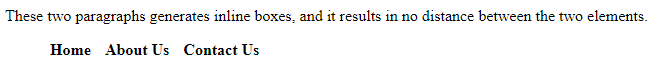
একাধিক html element কে একটা single লাইনে প্রদর্শনের display:inline ব্যবহৃত হয়। Inline Element গুলোতে আপনি left এবং right সাইড এ mergin এবং padding ব্যবহার করতে পারেন, কিন্তু top এবং bottom এ padding এবং mergin ব্যবহার করতে পারবেন না। নিচের উদাহরণ দেখুন:
<!DOCTYPE html>
<html>
<head>
<style>
p {
  display: inline;
}
li{
display:inline;
padding:5px;
font-weight:bold;
cursor:pointer;
}
li:hover{
background-color:green;
color:red;

}
</style>
</head>
<body>

<p>These two paragraphs generates inline boxes, and it results in</p>

<p>no distance between the two elements.</p>
<ul>
<li>Home</li>
<li>About Us</li>
<li>Contact Us</li>
</ul>

</body>
</html>
Output
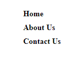
display:block
html element গুলোকে block আকারে প্রদর্শনের জন্য css এর display:block ব্যবহৃত হয়। আর html element গুলোর মধ্যে block element গুলো যেমন <p> এবং <div> tag গুলো বাই ডিফল্ট নিউ লাইনে বসে। আবার যেগুলো block element নয় সেগুলো যেমন <span> এবং <strong> ট্যাগ গুলো পাশাপাশি বসে। চলুন একটা উদাহরণ দিয়ে দেখা যাক:
<!DOCTYPE html>
<html>
<head>
<style>
li{
	display:block;
	padding:5px;
	font-weight:bold;
	cursor:pointer;
	width:100px;
}
li:hover{
	background-color:green;
	color:red;
	width:100px;
}
</style>
</head>
<body>
<ul>
<li>Home</li>
<li>About Us</li>
<li>Contact Us</li>
</ul>
</body>
</html>
Output
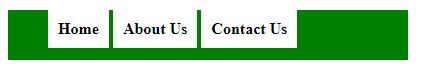
display:inline-block
display:Inline-block অনেকটা inline এর মতোই , পার্থক্য হচ্ছে display:Inline-block এ width এবং height কাজ করে , কিন্তু display:inline এ width এবং height কাজ করেনা। চলুন নিচের উদাহরণ দেখা যাক:
<!DOCTYPE html>
<html>
<head>
<style>
div{
	background-color:green;
	width:400px;
	height:50px;
}
li{
	display:inline-block;
	padding:10px;
	font-weight:bold;
	cursor:pointer;
	background-color:white;
}
li:hover{
	background-color:green;
	color:red;
}
</style>
</head>
<body>
<div>
<ul>
<li>Home</li>
<li>About Us</li>
<li>Contact Us</li>
</ul>
</div>
</body>
</html>
Output
display:contents
সরাসরি কোনো html Element, Class অথবা Id এর উপর ব্যবহৃত style কে Omit অর্থাৎ নিষ্ক্রিয় করার জন্য CSS display:contents ব্যবহৃত হয়।
প্রথমে দেখা যাক display:contents ব্যবহার ছাড়া একটা box এর Output কেমন আসে।
<!DOCTYPE html>
<html>
<head>
<style>
.content {
  border: 2px solid #999;
  background-color: #ccc;
  border-radius: 5px;
  padding: 10px;
  width: 400px;
}

.inner {
  border: 2px solid red;
  border-radius: 5px;
  padding: 10px;
}
</style>
</head>
<body>
<div class="content">
  <div class="inner">
    <p>This is the inner box. If display: contents works in your browser you will see a full width box with a red border.</p>
    <p>If display: contents does not work or if you remove the display property from .content you will see a 400 pixel box with a grey border and background color, inside will be nested the box with the red border.</p>
  </div>
</div>
</body>
</html>
Output
This is the inner box. If display: contents works in your browser you will see a full width box with a red border.
If display: contents does not work or if you remove the display property from .content you will see a 400 pixel box with a grey border and background color, inside will be nested the box with the red border.
এখন আমরা .content class এ display:contents property ব্যবহার করব , এতে আপনি দেখবেন .content class এর সব style Omit অর্থাৎ নিষ্ক্রিয় হয়ে যাবে। চলুন দেখা যাক:
<!DOCTYPE html>
<html>
<head>
<style>
.content {
  border: 2px solid #999;
  background-color: #ccc;
  border-radius: 5px;
  padding: 10px;
  width: 400px;
  display:contents;
}

.inner {
  border: 2px solid red;
  border-radius: 5px;
  padding: 10px;
}
</style>
</head>
<body>
<div class="content">
  <div class="inner">
    <p>This is the inner box. If display: contents works in your browser you will see a full width box with a red border.</p>
    <p>If display: contents does not work or if you remove the display property from .content you will see a 400 pixel box with a grey border and background color, inside will be nested the box with the red border.</p>
  </div>
</div>
</body>
</html>
Output
This is the inner box. If display: contents works in your browser you will see a full width box with a red border.
If display: contents does not work or if you remove the display property from .content you will see a 400 pixel box with a grey border and background color, inside will be nested the box with the red border.
ব্যাখ্যা: লক্ষ্য করুন .content class এর সব style Omit অর্থাৎ নিষ্ক্রিয় হয়ে গেছে।
CSS দিয়ে table তৈরী
যদিও html এর table তৈরীর tag গুলো দিয়ে যেকোনো table তৈরী অনেক সহজ , তবে css এর display property ব্যবহার করে আপনি এই কাজটি আরো ভালো এবং সহজভাবে করতে পারেন। চলুন css table property ব্যবহার করে প্রথমে একটা সাধারণ 4 row * 4 column এর একটা টেবিল তৈরী করা যাক:
<!DOCTYPE html>
<html>
<head>
	<title>CSS Display Table</title>
	<style type="text/css" media="screen">
	div{
			border:1px solid green;
		}
		.table{
			display:table;
		}
		.row{
			display:table-row;
		}
		.col{
			display:table-cell;
			height: 30px;
			text-align: center;
			padding:5px;
		}
		.caption{
			display:table-caption;
			border:none;
		}
	</style>
</head>
<body>

<div class="table">
	<div class="caption"><center>CSS Table</center></div>
	<div class="row">
		<div class="col"><strong>Id</strong></div>
		<div class="col"><strong>Name</strong></div>
		<div class="col"><strong>Mobile</strong></div>
		<div class="col"><strong>Address</strong></div>
	</div>
	<div class="row">
		<div class="col">1</div>
		<div class="col">Habib</div>
		<div class="col">01788990000</div>
		<div class="col">Dhaka,Bangladesh</div>
	</div>
	<div class="row">
		<div class="col">2</div>
		<div class="col">Zahid</div>
		<div class="col">01688776699</div>
		<div class="col">Khulna,Bangladesh</div>
	</div>
        <div class="row">
		<div class="col">3</div>
		<div class="col">Rashed</div>
		<div class="col">01988776699</div>
		<div class="col">Barishal,Bangladesh</div>
	</div>
</div>
</body>
</html>
Output
ব্যাখ্যা: লক্ষ্য করুন , আমরা এখানে display:table ব্যবহার করেছি , table start করার জন্য, তারপর display:table-row ব্যবহার করেছি table এর row গুলোর জন্য এবং display:table-cell ব্যবহার করেছি table এর কলামের cell গুলো তৈরী করার জন্য , এ ছাড়া display:table-caption ব্যবহার করেছি table এর ক্যাপশন দেওয়ার জন্য।
table এর row গুলোকে column আকারে ভাগ করা :
table এর row গুলোকে column আকারে ভাগ করার জন্য আপনি display:table-column ব্যবহার করতে পারেন , চলুন দুটি উদাহরণের মাধ্যমে ব্যাপারটা বুঝে নেয়া যাক:
Table without Column Example
<!DOCTYPE html>
<html>
<head>
	<title>CSS Table without Extra Column</title>
	<style type="text/css" media="screen">
	div{
			border:1px solid green;
		}
		.table{
			display:table;
		}
		.row{
			display:table-row;
		}
		.col{
			display:table-cell;
			height: 30px;
			text-align: center;
			padding:5px;
		}
		.caption{
			display:table-caption;
			border:none;
		}
	</style>
</head>
<body>
<div class="table">
	<div class="caption"><center>Table without Extra Column</center></div>
	<div class="row">
		<div class="col"><strong>Id</strong></div>
		<div class="col"><strong>Name</strong></div>
		<div class="col"><strong>Mobile</strong></div>
		<div class="col"><strong>Address</strong></div>
	</div>
	<div style="display:table-row;">
		<div class="col">1</div>
		<div class="col">Habib</div>
		<div class="col">01788990000</div>
		<div class="col">Dhaka,Bangladesh</div>
	</div>
	<div class="row">
		<div class="col">2</div>
		<div class="col">Zahid</div>
		<div class="col">01688776699</div>
		<div class="col">Khulna,Bangladesh</div>
	</div>
        <div class="row">
		<div class="col">3</div>
		<div class="col">Rashed</div>
		<div class="col">01666776699</div>
		<div class="col">Bogra,Bangladesh</div>
	</div>
</div>
</body>
</html>
Output
Table with Column Example
<!DOCTYPE html>
<html>
<head>
	<title>CSS Table with Extra Column</title>
	<style type="text/css" media="screen">
	div{
			border:1px solid green;
		}
		.table{
			display:table;
		}
		.row{
			display:table-row;
		}
		.col{
			display:table-cell;
			height: 30px;
			text-align: center;
			padding:5px;
		}
		.caption{
			display:table-caption;
			border:none;
		}
		.column1{
			display:table-column;
		 	background-color:#87CEEB;
		 	border:none;
		}
		.column2{
			display:table-column;
			background-color:#F44238;
			border:none;
	</style>
</head>
<body>
<div class="table">
	<div class="caption"><center>Table with Extra Column</center></div>
	<div class="column1"></div>
        <div class="column2"></div>
	<div class="row">
		<div class="col"><strong>Id</strong></div>
		<div class="col"><strong>Name</strong></div>
		<div class="col"><strong>Mobile</strong></div>
		<div class="col"><strong>Address</strong></div>
	</div>
	<div style="display:table-row;">
		<div class="col">1</div>
		<div class="col">Habib</div>
		<div class="col">01788990000</div>
		<div class="col">Dhaka,Bangladesh</div>
	</div>
	<div class="row">
		<div class="col">2</div>
		<div class="col">Zahid</div>
		<div class="col">01688776699</div>
		<div class="col">Khulna,Bangladesh</div>
	</div>
        <div class="row">
		<div class="col">3</div>
		<div class="col">Rashed</div>
		<div class="col">01666776699</div>
		<div class="col">Bogra,Bangladesh</div>
	</div>
</div>
</body>
</html>
Output
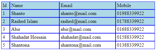
table এর row গুলোকে কে group আকারে ভাগ
table এর row গুলোকে group আকারে ভাগ করার জন্য আপনি display:table-row-group; ব্যবহার করতে পারেন , চলুন উদাহরণের মাধ্যমে ব্যাপারটা বুঝে নেয়া যাক:
<!DOCTYPE html>
<html>
<head>
	<title>Table Row Group</title>
	<style type="text/css" media="screen">
		.table {
			display: table;
			border:1px solid green;
			width:500px;
		}
		.table-row-group {
			display: table-row-group;
		}
		.table-row {
			display: table-row;
		}
		.table-cell {
			display: table-cell;
			padding: .2em;
			border:1px solid blue;
		}
		.table-row-group:first-child {
			background-color: lightblue;
		}
	</style>
</head>
<body>
<div class="table">
  <div class="table-row-group">
    <div class="table-row">
      <div class="table-cell">Id</div>
      <div class="table-cell">Name</div>
      <div class="table-cell">Email</div>
      <div class="table-cell">Mobile</div>
    </div>
    <div class="table-row">
      <div class="table-cell">1</div>
      <div class="table-cell">Shanto</div>
      <div class="table-cell">shanto@mail.com</div>
      <div class="table-cell">01988339922</div>
    </div>
    <div class="table-row">
      <div class="table-cell">2</div>
      <div class="table-cell">Rashed Islam</div>
      <div class="table-cell">rashed@mail.com</div>
      <div class="table-cell">01788339922</div>
    </div>
  </div>
  <div class="table-row-group">
    <div class="table-row">
      <div class="table-cell">3</div>
      <div class="table-cell">Abir</div>
      <div class="table-cell">abir@mail.com</div>
      <div class="table-cell">01688339922</div>
    </div>
    <div class="table-row">
      <div class="table-cell">4</div>
      <div class="table-cell">Shahadat Hossain</div>
      <div class="table-cell">shahadat@mail.com</div>
      <div class="table-cell">01588339922</div>
    </div>
    <div class="table-row">
      <div class="table-cell">5</div>
      <div class="table-cell">Shantona</div>
      <div class="table-cell">shantona@mail.com</div>
      <div class="table-cell">01388339922</div>
    </div>
  </div>
</div>
</body>
</html>
Output
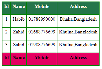
css table-header-group এবং table-footer-group এর মাধ্যমে table এর header এবং footer নির্ধারণ :
table এর এক বা একাধিক row কে header করার জন্য আপনি display:table-header-group; ব্যবহার করতে পারেন ,আবার এক বা একাধিক row কে footer করার জন্য আপনি display:table-footer-group; ব্যবহার করতে পারেন চলুন উদাহরণের মাধ্যমে ব্যাপারটা বুঝে নেয়া যাক:
<!DOCTYPE html>
<html>
<head>
	<title>Display Table</title>
	<style>
		div{
			border:1px solid green;
		}
		.table{
			display:table;
		}
		.row{
			display:table-row;
		}
		.col{
			display:table-cell;
			height: 30px;
			text-align: center;
			padding:5px;
		}

		.table-header{
			display: table-header-group;
			background-color:#25764A;
			color:#fff;
			font-weight: bold;
		}
		.table-footer{
			display: table-footer-group;
			background-color: #E40061;
			font-weight: bold;
		}
   </style>
</head>
<body>
<div class="table">
	<div class="row">
		<div class="col">1</div>
		<div class="col">Habib</div>
		<div class="col">01788990000</div>
		<div class="col">Dhaka,Bangladesh</div>
	</div>
	<div class="row">
		<div class="col">2</div>
		<div class="col">Zahid</div>
		<div class="col">01688776699</div>
		<div class="col">Khulna,Bangladesh</div>
	</div>
	<div class="row">
		<div class="col">3</div>
		<div class="col">Sahid</div>
		<div class="col">01988776699</div>
		<div class="col">Khulna,Bangladesh</div>
	</div>
	<div class="table-header">
	<div class="row">
		<div class="col">Id</div>
		<div class="col">Name</div>
		<div class="col">Mobile</div>
		<div class="col">Address</div>
	</div>
	</div>
	<div class="table-footer">
	<div class="row">
		<div class="col">Id</div>
		<div class="col">Name</div>
		<div class="col">Mobile</div>
		<div class="col">Address</div>
	</div>
	</div>
</div>
</body>
</html>
Output
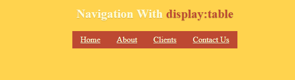
display:table ব্যবহার করে navigation menu তৈরীর কৌশল:
display:table ব্যবহার করে কিভাবে navigation menu তৈরী করা যায় নিচে তা দেখানো হলো
<!DOCTYPE html>
<html>
<head>

    <style type="text/css" media="screen">
   /* Dynamic navigation stays in middle */

body {
  text-align: center;
  background: #FFD34E;
  color: #FFFAD5;
  text-shadow: 0 1px 1px rgba(0,0,0,0.2);
}

ul {
  list-style: none;
  margin: 0;
  padding: 0;
}

li {
  float: left;
  background-color: #BD4932;
}

li a {
  display: block;
  padding: .5em 1em;
  color: #FFFAD5;
}

.nav-table {
  display: table;
  margin: auto
}
.orange {
  color: #BD4932;
}

    </style>
</head>
<body>
<h2>Navigation With <span class="orange">display:table</span></h2>
<nav role='navigation' class="nav-table">
  <ul>
    <li><a href="#">Home</a></li>
    <li><a href="#">About</a></li>
    <li><a href="#">Clients</a></li>
    <li><a href="#">Contact Us</a></li>
  </ul>
</nav>
</body>
</html>
Output
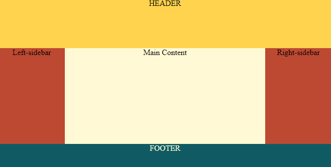
display:table ব্যবহার করে Responsive Layout তৈরীর কৌশল:
display:table ব্যবহার করে কিভাবে Responsive Layout তৈরী করা যায় নিচে তা দেখানো হলো
<!DOCTYPE html>
<html>
<head>

<style type="text/css" media="screen">
   body {
   	background: #FFFAD5;
   	color: black;
   }
.wrapper {
  height: 100%;
  display: table;
  width: 100%;
  text-align: center;
}
.header {
  display: table-row;
  height: 100px;
  background: #FFD34E;
}
.main {
  height: 100%;
  display: table;
  width: 100%;
}
.box {
  display: table-cell;
}
.sidebar {
  width: 20%;
  background: #BD4932;
}
.footer {
  display: table-row;
  height: 50px;
  background: #105B63;
  color: #FFFAD5;
}
/*====== Ignore section below ======*/
/* Basic Style*/
* {
  margin: 0;
  padding: 0;
}
html,
body {
  height: 100%;
}
    </style>
</head>
<body>
<div class="wrapper">
  <div class="header">HEADER</div>
  <div class="main">
    <div class="box sidebar">Left-sidebar</div>
    <div class="box content">Main Content</div>
    <div class="box sidebar">Right-sidebar</div>
  </div>
  <div class="footer">FOOTER</div>
</div>
</body>
</html>
Output
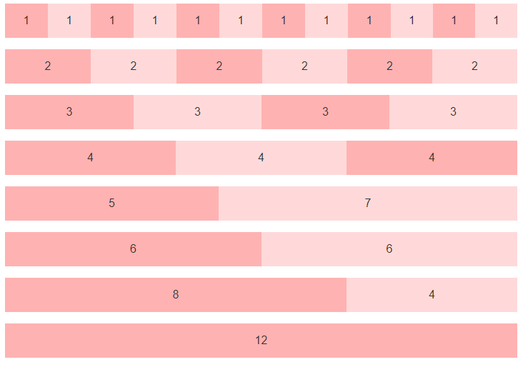
display:table ব্যবহার করে Responsive grid Layout তৈরীর কৌশল:
display:table ব্যবহার করে কিভাবে Responsive Grid Layout তৈরী করা যায় নিচে তা দেখানো হলো
<!DOCTYPE html>
<html>
<head>

<style type="text/css" media="screen">
 * { box-sizing: border-box; }

body{
    font-family:sans-serif;
}

/* Holds and centers the site content */
.container {
  max-width: 940px;
  margin-right: auto;
  margin-left: auto;
}


/*
 * The Grid
 */

@media (min-width: 600px) {
  /* Add `.grid` for the table */
  .grid {
    display: table;
    width: 100%;
    table-layout: fixed;
  }

  /* Add `.col` for the table cells, or columns */
  .col {
    display: table-cell;
  }

  /* Set the widths */
  .col-1 { width: 8.333333%; }
  .col-2 { width: 16.666667%; }
  .col-3 { width: 25%; }
  .col-4 { width: 33.333333%; }
  .col-5 { width: 41.666667%; }
  .col-6 { width: 50%; }
  .col-7 { width: 58.333333%; }
  .col-8 { width: 66.666667%; }
  .col-9 { width: 75%; }
  .col-10 { width: 83.333333%; }
  .col-11 { width: 91.666667%; }
  .col-12 { width: 100%; }

  /* Padded columns */
  .grid-padded {
    margin-left:  -1rem;
    margin-right: -1rem;
  }
  .grid-padded .grid {
    border-spacing: 1rem 0;
  }
}


/*
 * Vertically center grid content
 *
 * Requires content within the column to be inline or inline-block.
 */

.grid-align-middle .col {
  vertical-align: middle;
}

/* Make it red for easy views */
.grid-example {
  margin-bottom: 1rem;
}
.grid-example .col {
  line-height: 3;
  text-align: center;
  color: #333;
  background-color: rgba(255,0,0,.15);
}
.grid-example .col:nth-child(odd) {
  background-color: rgba(255,0,0,.3);
}

/* Nested grid examples need outdenting because padding. */
.grid-example .grid-example {
  margin-top: .5rem;
  margin-bottom: 0;
}

/* Increase height of vertically centered example */
.grid-example.grid-align-middle {
  height: 200px;
}
.grid-example.grid-align-middle .col {
  min-height: 3rem;
  line-height: 1.5;
}
    </style>
</head>
<body>
<div class="grid grid-example">
	<div class="col col-1">1</div>
    <div class="col col-1">1</div>
    <div class="col col-1">1</div>
    <div class="col col-1">1</div>
    <div class="col col-1">1</div>
    <div class="col col-1">1</div>
    <div class="col col-1">1</div>
    <div class="col col-1">1</div>
    <div class="col col-1">1</div>
    <div class="col col-1">1</div>
    <div class="col col-1">1</div>
    <div class="col col-1">1</div>
</div>
<div class="grid grid-example">
	<div class="col col-2">2</div>
	<div class="col col-2">2</div>
	<div class="col col-2">2</div>
	<div class="col col-2">2</div>
	<div class="col col-2">2</div>
	<div class="col col-2">2</div>
</div>
<div class="grid grid-example">
	<div class="col col-3">3</div>
	<div class="col col-3">3</div>
	<div class="col col-3">3</div>
	<div class="col col-3">3</div>
</div>
<div class="grid grid-example">
	<div class="col col-4">4</div>
	<div class="col col-4">4</div>
	<div class="col col-4">4</div>
</div>
<div class="grid grid-example">
	<div class="col col-5">5</div>
	<div class="col col-7">7</div>
</div>
<div class="grid grid-example">
	<div class="col col-6">6</div>
	<div class="col col-6">6</div>
</div>
<div class="grid grid-example">
	<div class="col col-8">8</div>
	<div class="col col-4">4</div>
</div>
<div class="grid grid-example">
	<div class="col col-12">12</div>
</div>
</body>
</html>
Output
Masud Alam
আমি মাসুদ আলম, বাংলাদেশের ৩৬ তম Zend Certified Engineer । ২০০৯ সালে কম্পিউটার সাইন্স থেকে বেচেলর ডিগ্রী অর্জন করি। দীর্ঘ ১৫ বছর আমি Winux Soft, SSL Wireless, IBCS-PRIMAX, Max Group, Canadian International Development Agency (CIDA), Care Bangladesh, World Vision, Hellen Keller, Amarbebsha Ltd সহ বিভিন্ন দেশি বিদেশী কোম্পানিতে ডেটা সাইন্স, মেশিন লার্নিং, বিগ ডেটা, ওয়েব ডেভেলপমেন্ট এবং সফটওয়্যার ডেভেলপমেন্ট এর উপর বিভিন্ন লিডিং পজিশন এ চাকরি এবং প্রজেক্ট লিড করি। এছাড়াও বাংলাদেশের ১৮৫ জন জেন্ড সার্টিফাইড ইঞ্জিনিয়ার এর মধ্যে ১২০ এরও অধিক ছাত্র আমার হাতে জেন্ড সার্টিফাইড ইঞ্জিনিয়ার হয়েছেন। বর্তমানে w3programmers ট্রেনিং ইনস্টিটিউট এ PHP এর উপর Professional এবং Advance Zend Certified PHP -8.2 Engineering, Laravel Mastering Course with ReactJS, Python Beginning To Advance with Blockchain, Machine Learning and Data Science, Professional WordPress Plugin Development Beginning to Advance কোর্স করাই। আর অবসর সময়ে w3programmers.com এ ওয়েব টেকনোলজি নিয়ে লেখালেখি করি।